 Marshall Farrier's tech blog
Predicting stock growth 2016-03-10
Some co-conspirators and I have been applying computational techniques such as machine learning and genetic programming to quantitative finance. We're trying to use these techniques to develop investment strategies optimized with respect to two metrics: growth and risk. An optimal investment strategy maximizes growth while minimizing risk. But maximizing growth and minimizing risk often conflict. A portfolio which maximizes expected growth is often riskier than one with less aggressive growth expectations. Here, I'll be talking only about our work toward accurately predicting growth. While there are well-known techniques for assessing and minimizing risk, predicting growth is very much an open problem. It is the main problem we've been working on.
Machine learning has been used for pattern recognition with an astonishing degree of success in a wide range of contexts. Fairly simple algorithms yield over 90% accuracy in reading hand-written digits, and other algorithms make it possible to classify objects appearing in digital images and to identify individuals through facial recognition techniques. But predicting market prices of publicly traded equities proves to be somewhat more difficult because price behavior is subject to significant unforeseeable fluctuations, or noise. After many failed and some partially successful experiments, we have, however, developed a technique for predicting growth with a reasonably high degree of accuracy. I'll discuss later in statistical terms what accuracy in this context means exactly. And, while the details of our algorithm are proprietary, I can also share a few of our results and discuss their significance and their limitations.
To illustrate our results more concretely, let me begin with a chart. I'll try
over the course of this article to explain more clearly what the chart
means and how the data underlying such charts can be used.
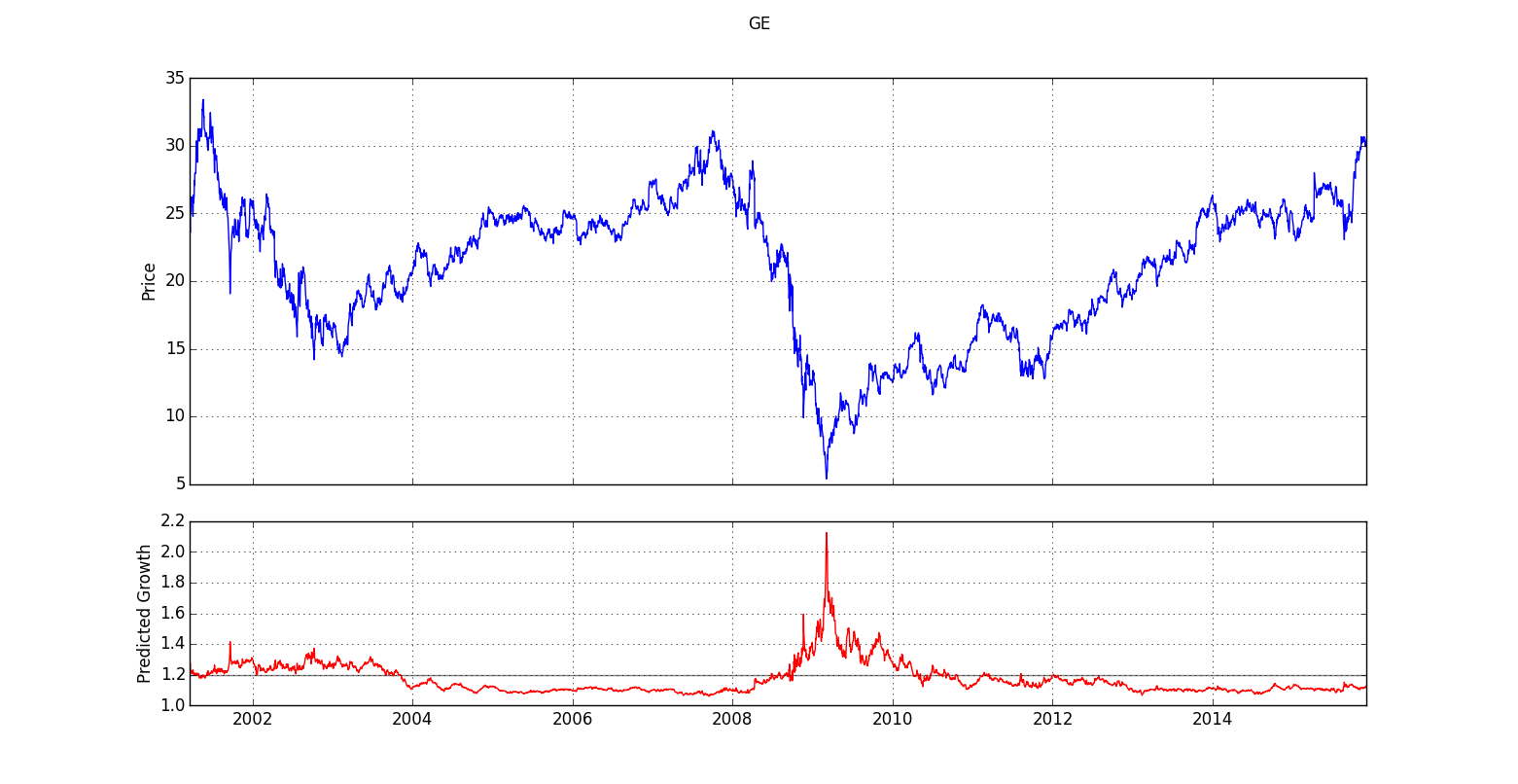 We see here actual adjusted price (blue) compared to predicted
growth (red) for GE over the last 20 years.
The upper portion of the chart plots values
pulled from Yahoo! Finance,
which provides not only historical prices but also adjusted closes for equities
traded on the major exchanges. The adjusted closes are closing prices that have been re-calibrated to account
for splits and dividends. Such adjustments are necessary to get a complete
picture of true return on investment, whether or not the stock has split and whether or not
it pays a dividend.
We see here actual adjusted price (blue) compared to predicted
growth (red) for GE over the last 20 years.
The upper portion of the chart plots values
pulled from Yahoo! Finance,
which provides not only historical prices but also adjusted closes for equities
traded on the major exchanges. The adjusted closes are closing prices that have been re-calibrated to account
for splits and dividends. Such adjustments are necessary to get a complete
picture of true return on investment, whether or not the stock has split and whether or not
it pays a dividend.
While the upper section of the chart shows adjusted close, the lower section plots predicted growth, which is generated by our machine learning algorithm using only information known in real time. The prediction made on August 30, 2010, for example, is based only on data that was already available at the time. Otherwise, we wouldn't be able to generalize to the present, the point in time from which we are trying to make predictions about an unknown future. The prediction on any given day is derived only from information available up until that time, just as right now, we have access only to past facts and must use those facts to make intelligent hypotheses about what is likely to happen in the future.
Looking more closely at the lower section of the chart, you should see
a grey horizontal line at about 1.2. This line represents average growth.
So, the model is predicting above average growth whenever the red line
is above the grey line and below average growth when the red line drops
below the grey. Growth here is the factor by which price grows
over a particular time period. If growth over time dt is 1.11,
then an initial value of $100 will be worth $111 = 1.11 * $100
after time dt. Return is thus simply growth - 1.0.
So, we are predicting a positive return as long as predicted growth is
greater than 1.0.
What immediately jumps out at us from this chart is the spike in predicted growth
in early 2009. While the model accurately identifies the crash
of 2009 as a great time to buy, it is important to understand how difficult it would have been
in real time to determine the exact best spot even with the help of the
predictions. At any given point in time, we know only the predictions
up to that point but not what the model will predict tomorrow or
a month from now. We don't know future predictions any more than we know future prices.
Relative to the average or to other equities, we can
say that predicted growth is better or worse, but tomorrow it
might be better still. We simply won't know until we have applied the model
to tomorrow's data.
For example, toward the
end of 2008, predicted growth spikes first to around 1.6, which translates
to a predicted 60% return on investment over the prediction period.
In real time, with knowledge only of events and metrics
up to that point, that would already seem like a great spot to buy, and
it would in fact have been a pretty good one, as long as you could
hold onto your hat through the bottom of the crash. If you waited
a little longer, however, until the stock went down another 50% to $5 in early 2009,
you would have done significantly better, as is in fact captured by subsequent predictions
using data unavailable at the time of the first spike. While our crystal ball
provides useful information, a lot of work remains for determining how best to make
use of the predictions in real time in an optimized investment strategy.
Yet the model clearly is detecting superior entry points. How
can we best use it to make our investments as profitable as possible?
I'll leave this question open for now. Before going into greater detail about the sense in which our predictions are accurate and the questions growing out of our analyses up to this point, I'd like to back up a bit and discuss some common pitfalls that we are studiously trying to avoid.
Optical illusions and the smugness of hindsight
I recently watched a rather lengthy video promising to solve exactly the problem we are addressing: predicting growth. The speaker claimed to have found a hidden technique for predicting with 100% accuracy entry points for buying stocks low and exit points for selling high. While I knew right away that the "100%" claim was at best an exaggeration, the idea sounded plausible, so I wrote some code to calculate and chart entry and exit points according to the algorithm that was finally laid out. The charts really did seem more often than not to mark sell points that were higher than the buy points. So, I backtested the algorithm on a random selection of stocks from the S&P over a 20 year period. While the algorithm generated a profit on a statistically relevant set of data, one would have in fact made more money by just investing an equal share in each of the randomly selected stocks and selling at the end of the trial. In other words, buy and hold was superior to the algorithm.
I tell this story mainly to emphasize how hard it is to beat buying and holding an index. Sure, you can look at some charts, find in hindsight the best buy and sell points, and then talk yourself into thinking there is a pattern that could have been spotted in advance. But this impression is almost invariably an optical illusion leading to what one might call the smugness of hindsight. Once we know what actually happened, our brains can't ignore that knowledge. So, when we look at past market data, we can't help but project patterns in hindsight onto the charts. That's just how our brains work. We are hardwired to see patterns in the world around us, but the patterns we see in stock charts generally prove to be optical illusions because we project current knowledge onto the past. Machines, on the other hand, don't suffer from the same smugness of hindsight: They can be programmed so that they really do (for purposes of backtesting) make use only of facts known at the time. But if you try to quantify and backtest out of sample (on data you haven't looked at yet) patterns created by humans with the benefit of hindsight, you'll find that they almost never hold up. They'll probably still make some money because the market as a whole has advanced. So even completely random entry and exit points can be expected to make money. But few algorithms can consistently beat buy and hold. When you sell at suboptimal exit points, as you sometimes will, you miss out on market upturns where the buy-and-hold strategist still makes a profit.
Our goal is to develop an algorithmic investment system that really does perform demonstrably better than buy and hold. One component of this system is making accurate growth predictions. It is this component that we are currently working on and that the above chart illustrates. Our system is designed to look for patterns over periods of several months and not for intraday patterns useful for day trading. Most investors, including us, don't have the resources (such as fast fiber-optic feeds in close proximity to the exchanges) to compete with brokerages that receive market data within nanoseconds of its availability, so we have focussed on medium- to long-term patterns where it doesn't matter so much if your data feed is seconds or minutes behind the market. We're concerned with predicting how well a stock is likely to perform in the coming weeks and months. Let's look now at how to get a statistically valid measure for the accuracy of such predictions.
Making accurate predictions
Stock prices are influenced by many unpredictable factors and
are thus subject to significant unforeseable fluctuations. From a predictive standpoint,
such fluctuations are just noise. Because of it, we can never
predict future prices exactly.
So, we need a measure by which to judge which of several inexact
predictions is the best. Standard error is the measure we are looking for to
quantify predictive accuracy.
The standard error of an estimate or prediction is the statistical
counterpart to standard deviation. Information on how to calculate it
is readily available, so I won't go into that here. What standard error means, though,
can be explained by a simple example: If we say that our predictions have a standard
error of 0.2 relative to known actual values, that means that about
2/3 of our estimates will be within 0.2 of the correct value.
The success of a machine learning algorithm is measured, then, by low standard error out of sample--i.e., on test data not visited by the algorithm while it was learning the model. Machine learning algorithms are designed to minimize error in sample, on the data from which the model is developed. So, they will invariably do well in sample but will not necessarily be useful out of sample. What that means in our context is that we might develop a model from past data on some random selection of stocks that makes very accurate predictions on those stocks for that time period. But its predictions may not be accurate out of sample, i.e., for different time periods or on stocks that were not used when developing the model.
Our baseline for predicting growth was the mean, which can be shown to be the constant model with the greatest accuracy. In other words, our baseline was to take a random selection of equities and simply calculate their average growth over a given forecast interval. The standard error of this constant prediction is then the value that needs to be beaten out of sample. Given the noisy fluctuations, this wasn't easy to do. As the basis for an investment strategy, this baseline prediction will invariably lead to buy and hold. The baseline prediction is in fact impossible to beat if it is true that current price alone is the best predictor of future price. As is well known among specialists in quantitative finance, buy and hold is hard to beat. Many experts believe that efficient markets price in all available information. If their hypothesis holds, current price is in fact the best predictor of future price, and buy-and-hold is the best investment strategy.
We have experimented with numerous technical indicators in search of features from which to derive models yielding predictions with consistently lower out-of-sample error than the baseline prediction. As input into machine learning algorithms, the features we have found yield modest but consistent improvements in accuracy when compared to the baseline. While these features and algorithms themselves are proprietary, I can share the growth predictions generated by using them on historical data. Such growth predictions are illustrated in charts like the one shown above for GE. Let's now take a closer look at two additional charts of this type in light of what we now know about the meaning of predictive accuracy and the importance of basing predictions only on data available in real time.
Use and limitations of growth predictions
Let's first zoom in on the most interesting time frame from the 20-year GE chart we looked at earlier:
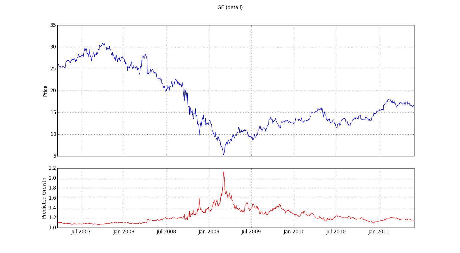
We see here the two years before and after the stock price bottomed out in early 2009. What stands out is the sharp peak in predicted growth corresponding exactly to the low in stock price. This suggests using high predicted growth as a signal to buy--despite the difficulties noted above in making optimal use of such predictions in real time. Another difficulty is that the chart doesn't seem to provide a comparable indicator of when to sell. Even in hindsight, it's really only the top chart that tells us that it would have been optimal to sell around October 1 2007. The lower chart generated by our model is of little help in finding this optimal selling point. Although the stock is about to crash from the high it achieves in October 2007, the model is still expecting a positive, albeit below average, return. In other words, while the model appears to make strong, and in this case accurate, predictions of windfall gains, it appears less willing to go out on a limb in predicting a crash. If this chart is representative, our prediction algorithm will be of more help in deciding when to buy than when to sell.
The chart for TSLA from late 2011 to the end of 2015 confirms this hypothesis but also exhibits some significant differences:
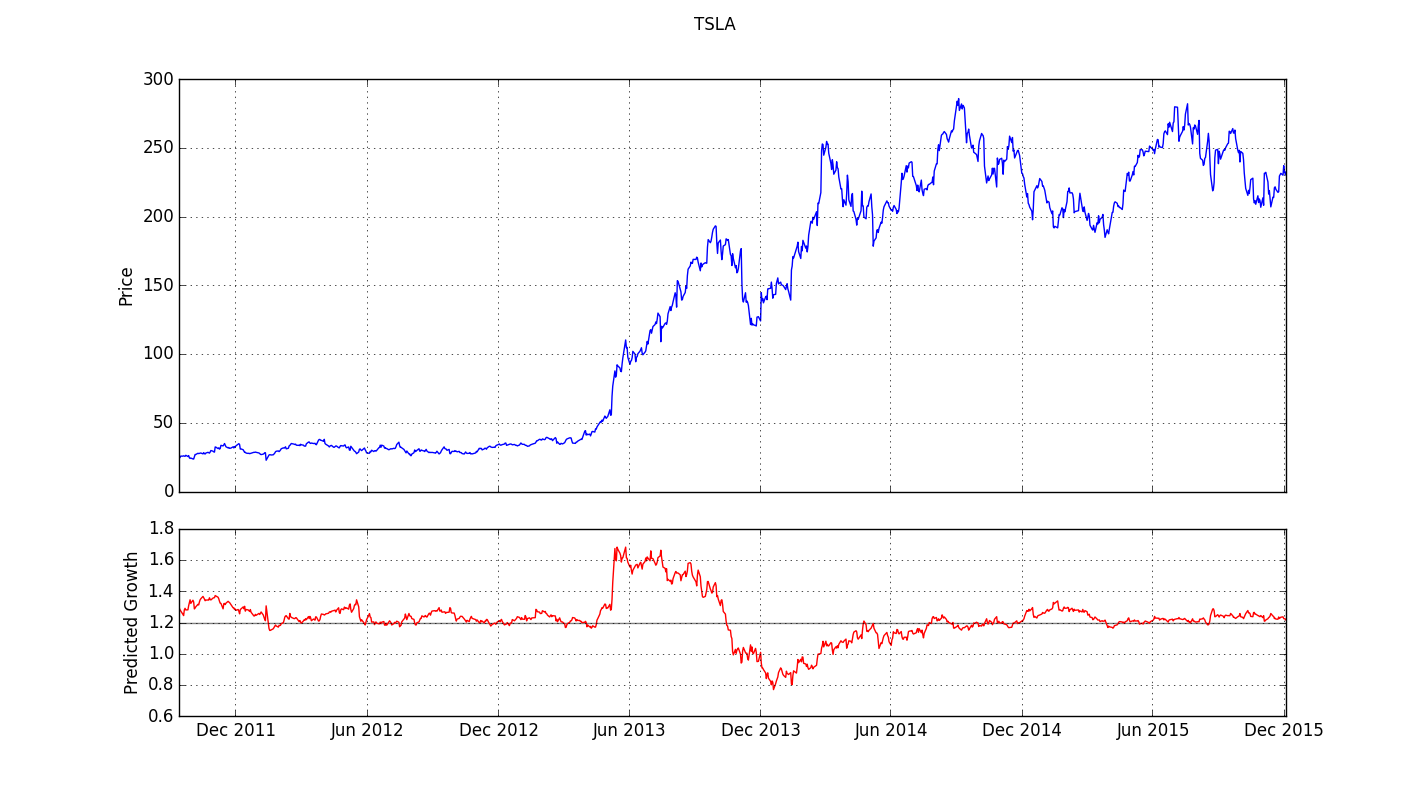
Here, too, the model shows a spike in predicted growth at an excellent buying point. In this case, though, the sudden increase doesn't take the form of a sharply pointed spike. Instead, the value achieved on the jump tapers off slowly for a good while before declining almost as sharply as it rose. But the price behavior of TSLA in this time frame is also quite different from that of GE 2007-2011. GE, as a mature, blue-chip company, declined dramatically over a period of about a year and a half, then suddenly reversed and began to recover. For TSLA, on the other hand, we're looking at a time frame starting only shortly after its IPO, and the stock price up until early 2013 stays fairly flat. It is re-assuring to see that the model, despite the differences between the two companies and between the patterns observed in the price charts, is able to identify advantageous entry points for both stocks.
For TSLA, however, the model also (and incorrectly) predicts negative growth in late 2013 and early 2014. This is while the stock is selling between roughly $130 and $200. In fact, the stock rarely dropped below $200 subsequently and approached $300 at times. It still had some growth left. This example also suggests that we should proceed with particular caution in selling based on the model.
Conclusions and summary
For making use of our model in an automated investment strategy, these observations
suggest that one might want to select stocks to buy
based on high predicted growth.
When the model has shown high predicted growth in the charts we have examined,
the stock has consistently outperformed the market. The model doesn't seem
to help a lot in terms of finding good times to sell, however. So, the
strategies we are currently considering simply hold on to
purchased equities for some fixed period of time (the length of this period being another parameter to
optimize). In other words, we would buy equity XYZ based on its superior predicted growth
at time t. After the fixed holding period days_to_hold, equity XYZ will be sold,
and another equity, which at time t + days_to_hold shows unusually high predicted
growth, will be purchased and held for the same prescribed period.
No model can predict bull and bear cycles with anything approaching 100% accuracy. Scientifically sound models, however, are inferred from statistics and designed to yield the lowest possible standard error based on metrics known in real time. They can't predict fluctuations due to noise, which is just the aggregate of causally relevant events that are unforeseeable in real time. We required numerous attempts, trying many different metrics, to arrive at a model yielding predictions more accurate out of sample than the baseline of average growth. The charts shown here reflect the output of that model and suggest that these growth predictions can provide useful input for investment strategies capable of outperforming buy and hold.
The strength of these investment strategies is that they are based on the knowledge that all financial predictions are fallible. And specific predictions are particularly fallible. The trick is finding investment strategies that limit risk while still providing superior growth expectations. Predictions are fallible because fundamentally unforeseeable factors influence prices. Detailed knowledge of an individual company can allow an investor to stay ahead of the market with regard to that company's stock, just as deep knowledge of global economic developments can make it possible to stay ahead of the averages. But no one can know when and to what extent subprime mortgages are going to unravel, how Greek debt will be handled or how a market crash in China will effect other economies. We should thus avoid putting our money on predictions that claim to be certain and instead work on making predictions more accurate and on developing investment strategies based on sound but fallible predictions.